Overview
Harrison has served the same area for over twenty years. Their reputation was strong locally but invisible to anyone who had not already heard of them.
Challenge
Emergency customers decide in seconds. Without a website, Harrison lost calls to larger competitors that simply looked more established online.
Website strategy
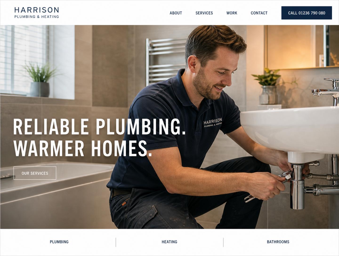
Answer three questions immediately: what they do, whether they are licensed and insured, and how to reach them right now.
Design
A high-energy cobalt and yellow identity with an oversized condensed hero, a call button impossible to miss, and hand-drawn line icons instead of stock photography.
Key features
- Tap-to-call bar fixed on mobile
- Service and coverage-area sections built for local search
- Reviews presented as plain quotes, not badges
- Sub-second load on a mobile connection
Desktop & mobile
Designed for both screens.
Result
Harrison now looks as established online as they are in the neighbourhood, and new customers arrive already knowing what the company does.
Want something like this for your business? Tell us a little about what you do.
Get Started